Positioning
The project has to make the category and business signal easier to understand before a prospect starts comparing alternatives.
A website case study for a sleep-focused brand where clarity, reassurance, and service explanation matter before conversion.
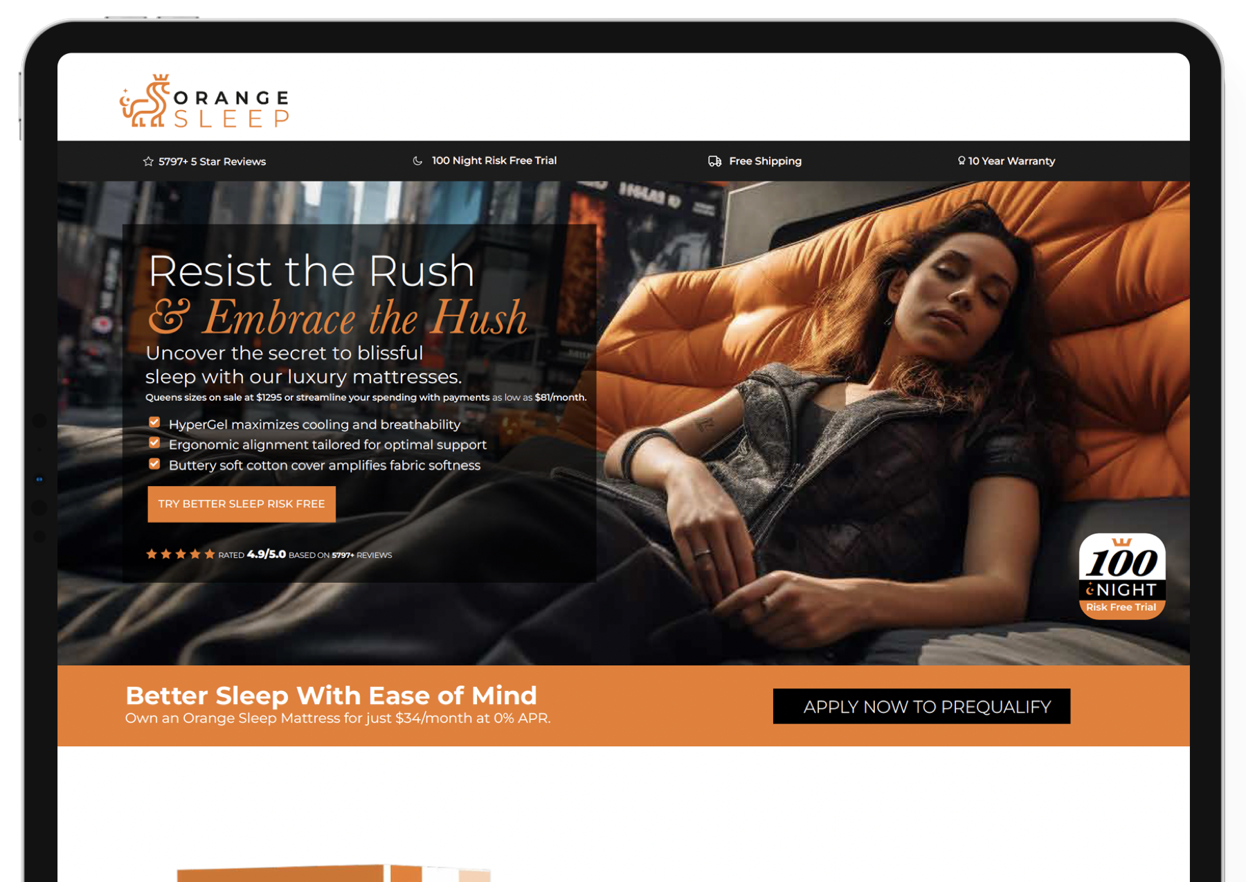
Sleep and wellness buyers often need education before they are ready to act. The site has to make the offer easier to understand without making the brand feel clinical or cold.
This case study needed to make the business situation clear before asking the viewer to care about the design. The page has to show what was being solved, why the work mattered, and how the brand, website, campaign, or system helped the client look more credible.
The proof angle is simple: Orange Sleep needed a more useful public-facing system, not a decorative one-off. The work had to support trust, clarity, and a cleaner path to the next business conversation.
The page connects visual presentation with practical business use. It gives the viewer enough context to understand the category, the buyer signal, the creative direction, and the reason this project belongs in the Envisionary proof library.
Sleep and wellness buyers often need education before they are ready to act. The site has to make the offer easier to understand without making the brand feel clinical or cold.
The design challenge is balancing credibility, warmth, service explanation, and a conversion path that feels natural.
This case study strengthens Envisionary's website-design proof by showing how a page can help buyers understand a higher-consideration service.
| Layer | Role In The Work |
|---|---|
| Buyer education | Explain the offer and reduce confusion before the visitor reaches out. |
| Trust design | Use clear hierarchy, proof, and calm presentation to support confidence. |
| Conversion path | Make inquiry feel like the next useful step. |
| Website proof | Support the Fort Lauderdale website design page with a wellness/service example. |
This case study is here because Orange Sleep shows how website design / home services has to support a real business situation: a specific buyer, a specific trust problem, and a specific reason to take the next step.
The useful read is whether the work reduces doubt, clarifies the offer, and makes the company easier to choose.
The project has to make the category and business signal easier to understand before a prospect starts comparing alternatives.
The page, brand, or campaign system has to organize proof in a way that helps the viewer move from curiosity to confidence.
The work should make the next step feel natural, whether that is a call, inquiry, consultation, signup, or deeper review of the offer.
Open the questions below for the practical details, fit, and next-step context.
It needs trust, education, clear next steps, and a design tone that feels credible without feeling cold.
It supports the same buyer pattern: people compare options, need trust, and want clear explanation before contacting.
The buyer may not know what solution fits, so the page has to organize information before asking for action.
A consultation, call, or guided inquiry that lets the visitor explain their current problem.
Bring your idea, current project, or agency brief. We’ll talk through what you need, what’s holding it up, your timing, and where I can help. If we’re a fit, we’ll agree on the next step.