No. This is a self-initiated Envisionary Design fan project. It is not an official website and does not imply William Montgomery’s approval or endorsement.
Three visual identitiesProject scope | 01
Responsive fan websiteProject scope | 02
Show discoveryProject scope | 03
Search & sharingProject scope | 04
Selected work
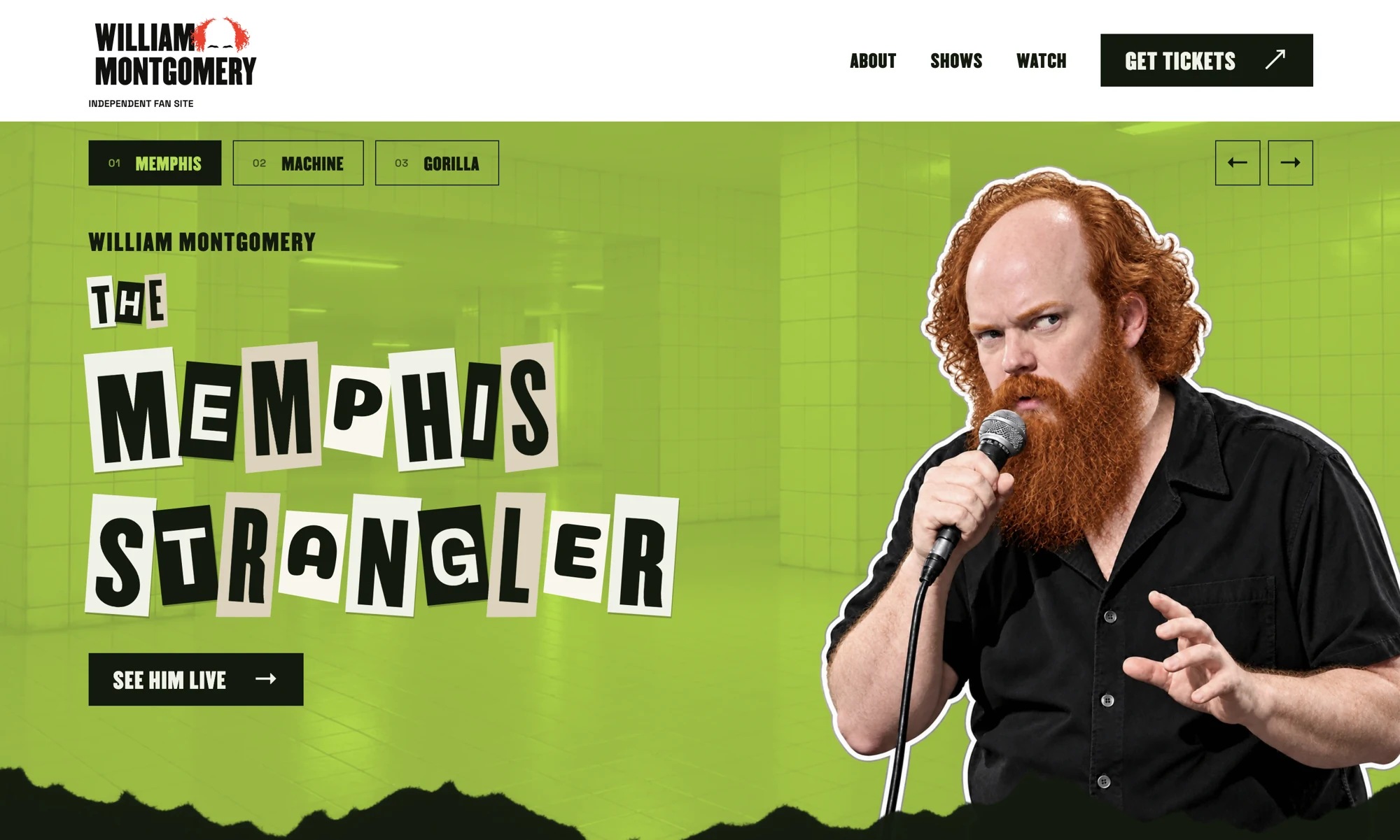
The short version
A self-initiated William Montgomery fan website by Envisionary Design, with three visual identities, AI-directed imagery, upcoming shows, and ticket links.
One comedian. Three identities. Plenty to work with.
I started this because I like William Montgomery’s comedy. The Memphis Strangler, The Big Red Machine, and The Vanilla Gorilla were too good to leave as a line in a biography. I wanted to see what happened when each nickname became the visual direction for an entire website.
What I built
I designed and built a one-page independent fan site around a three-character hero. Visitors can switch identities, read about William, find upcoming shows, and reach his existing platforms. My role covered creative direction, typography, AI imagery, responsive development, search metadata, and launch.
What the work includes
| Deliverable | Role in the project |
|---|---|
| Three visual identities | Distinct characters, typography, environments, and page-wide accent colors. |
| Responsive fan website | One consistent layout with manual hero controls and mobile swipe support. |
| Show discovery | Refreshing Punchup listings, a saved fallback, and external ticket links. |
| Search & sharing | Metadata, structured data, descriptive image assets, sitemap, and social preview. |
Pick a nickname. Change the whole mood.
The fun started when I stopped treating the nicknames as copy and started treating them as characters. William already had three ridiculous entrances. I gave each one its own room.
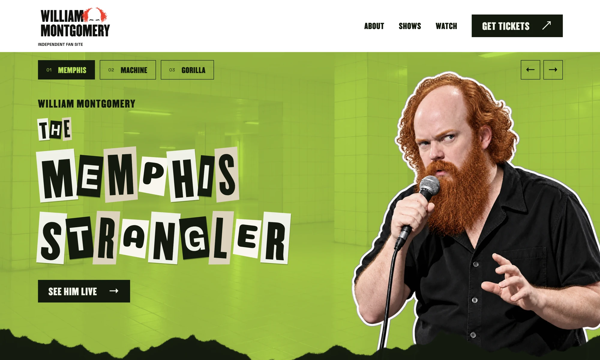
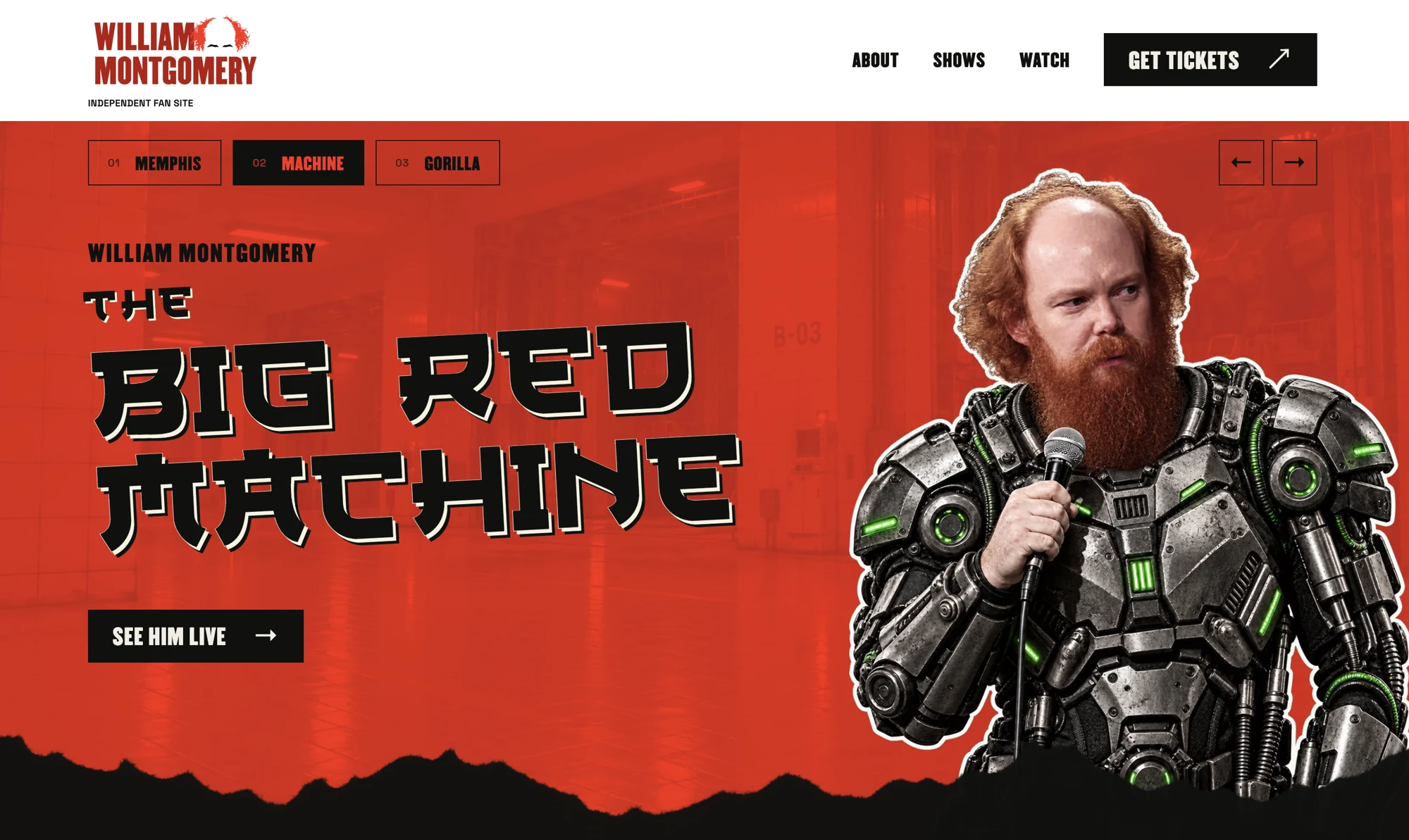
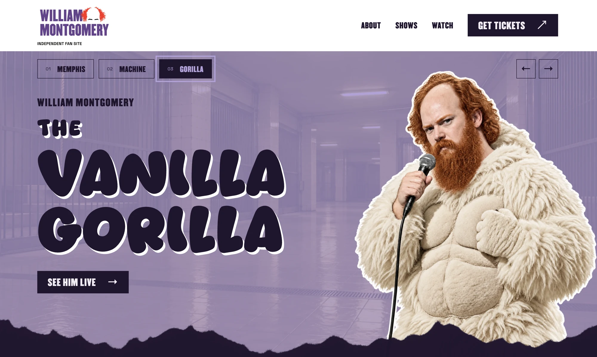
The Memphis Strangler gets acid green, ransom-note lettering, and an unsettling tiled corridor. The Big Red Machine gets red, mechanical armor, and Japanese anime-inspired type. The Vanilla Gorilla gets purple, a cream gorilla suit, and big rounded letters. Same comedian. Very different wardrobe budget.
Then I took the idea past the hero. Choose a nickname and the accent colors follow you down the page: buttons, social boxes, and parts of the logo change with it. The logo’s red hair stays red. The torn-paper edges pick up the adjoining section color, so the whole page feels like it belongs to the character you picked.
That was the part I enjoyed most: making the site feel like it is in on the joke. The portraits, strange environments, and mismatched typography get to have fun, while the show dates and ticket links remain easy to find. You can play with the personalities without losing your place.
The three website themes
AI imagery needed a director
I used AI to create the character portraits and environments, then worked through the details: William’s receding hairline, auburn beard, facial likeness, costumes, framing, and the white cutout outlines. These are disclosed as AI-generated fan artwork.
The design work was bringing those images into one system. Each character has a different type treatment, but the same page structure, paper tears, and clear route to the shows. Champion Gothic carries the display typography; Space Grotesk keeps the longer copy readable.
A useful destination for fans
The page brings together a biography, William’s connection to Kill Tony, upcoming dates, videos, podcast links, social profiles, and Cameo. Show listings refresh from Punchup’s public data, with a saved schedule as a fallback.
Ticket buttons return fans to William’s Punchup page for current availability and booking. The fan site does not sell tickets or process payments.
Built to work on a phone
The hero has manual controls and swipe support, so visitors choose when the character changes. The mobile layout keeps the names, portraits, and ticket links readable without horizontal scrolling.
The scene backgrounds were converted from roughly 6.1 MB of PNGs to about 319 KB of WebP files combined. The first scene loads early; the other backgrounds load after the initial page resources. That reduces the image payload by about 95% while retaining the subtle texture.
Search foundations, without the promises
Page copy connects William Montgomery with all three nicknames. Descriptive image filenames and alt text, canonical metadata, structured data, a sitemap, and a three-character social share image give the site a clear identity outside the page itself.
Those are implementation details, not a claim of search rankings or increased ticket sales. This project demonstrates my creative direction, AI image direction, and website design through something I wanted to make.
Independent, from the beginning
This is a self-initiated Envisionary Design project made out of appreciation for William’s comedy. William Montgomery did not commission it. It is not his official website and is not affiliated with, sponsored by, or endorsed by him or his representatives.
His three nicknames and Kill Tony connection are documented in his published Ticketmaster biography. Artist names, photographs, and linked content remain the property of their respective owners.
FAQ
Questions This Work Answers
Open the questions below for the practical details, fit, and next-step context.
The portrait, environment, typography, and page-wide accent colors change. The content and navigation remain consistent across the three identities.
The themed hero portraits and environments are AI-generated fan artwork, directed and refined for this project. The fan website discloses that distinction.
No. It displays show information and sends visitors to William’s Punchup page for current details and ticket options.
Yes. The same process can develop a distinct visual direction around a brand’s actual personality, with the content, imagery, and booking or inquiry flow planned for its audience.
Let’s talk about what you need to build.
Bring your idea, current project, or agency brief. We’ll talk through what you need, what’s holding it up, your timing, and where I can help. If we’re a fit, we’ll agree on the next step.