More Office Logo Regrets: Why Cheap Logos Are Michael Scott-Level Awkward!
Attention, fellow “Office” fans! Picture this: Michael Scott, our lovable and cringe-worthy regional manager, faces a logo disaster of his own making. Let’s take a hilarious journey through the awkwardness and regret that comes with getting a cheap logo. Brace yourself for some laughs and valuable lessons!
🤦♂️ Michael’s Logo Fiasco:
Michael Scott, in his quest for savings, opted for a “World’s Cheapest Logo” deal. Oh boy, what a mistake!
Michael thought he was being a savvy businessman by choosing the cheapest logo design option available. He envisioned himself as the hero of the Scranton Business Park, saving his company’s budget while still getting a professional-looking Logo Design. Little did he know the cringeworthy disaster that awaited him.
💔 The Awkward Design:
The logo arrived, leaving Michael speechless and everyone else cringing. It was a combination of random clipart, Comic Sans, and a rainbow of colors that could put a unicorn to shame.
Picture it: Michael excitedly opens the email containing the long-awaited logo design. As he lays eyes on it, his face contorts into a mix of confusion, disappointment, and disbelief. He tries to process the mishmash of elements that make up the design—clipart that seems randomly chosen, a font that screams unprofessionalism, and a color palette that clashes in the most cringe-worthy way.
Michael’s initial reaction is to laugh nervously, hoping that it’s all a joke. But as the silence in the room persists and his team’s confused gazes meet his, he realizes that it’s not a prank. It’s his logo design, and it’s a disaster.
⏰ Endless Awkward Explanations:
As Michael unveiled the logo to his team, the awkward silence was deafening. He tried to justify it with, “It’s…uh…unique! Like Dwight’s fashion sense!”
Michael, ever the master of improvisation, attempts to salvage the situation with a quick-witted comment. But his words fall flat, leaving his team even more perplexed and uncomfortable. He stumbles through a series of awkward explanations, desperately trying to convince himself and his colleagues that the logo design is a stroke of genius. Alas, his efforts only make the situation more cringe-worthy.
🚫 Zero Brand Identity:
The logo had nothing to do with the company’s vision or values. It was like putting a stapler on a Dunder Mifflin letterhead. Awkward squared!
A good logo should encapsulate a company’s essence, reflect its brand identity and values, and communicate its unique identity. Unfortunately, Michael’s cheap logo failed on all fronts. It had no connection to the company’s vision or values. It was as if he had slapped a random assortment of elements together without any thought or consideration. The result? A logo that left everyone scratching their heads, wondering what it had to do with the business they knew and loved.
📅 The Regretful Forever:
Each time Michael saw the logo, he cringed harder than when Toby walked into the office. It haunted him like a Dwight prank gone wrong.
The logo design became a constant reminder of Michael’s brand indignity. Every time he saw it on a business card, a website, or a promotional item, he couldn’t help but grimace and feel a pang of regret. It served as a painful symbol of his ill-advised decision to prioritize cost over quality.
✨ The Power of Professionalism:
Michael soon realized that going the cheap route wasn’t worth the awkwardness and regret. He sought professional help, embracing a logo design that truly reflected his brand.
After enduring the cringe-inducing consequences of his cheap logo design, Michael learned his lesson. He recognized the importance of investing in professional graphic design services. He understood that a well-crafted logo design could be a powerful tool for brand recognition, establishing credibility, and connecting with customers.
Dont be a Michael
Valuable Lessons:
Now, let’s extract some valuable lessons from Michael’s logo design misadventure:
- Don’t Sacrifice Quality: A cheap logo design may save you money upfront, but it’ll cost you in the long run with cringe-worthy embarrassment.
- Brand Identity Matters: A logo design should represent your business values, not make you the laughingstock of the Scranton Business Park.
- Invest in Professionals: Embrace the expertise of professional graphic designers who can craft a logo design that will make you feel like the “World’s Best Businessperson.”
Don’t let your logo design journey become an “Office” blooper reel! Say goodbye to awkwardness and avoid needless embarrassment. Schedule a consultation with a professional graphic designer today and let’s create a logo design that will make Michael Scott proud. Click the link in my bio or send a DM to get started on your logo design success story. Let’s transform your brand with confidence and laughter!
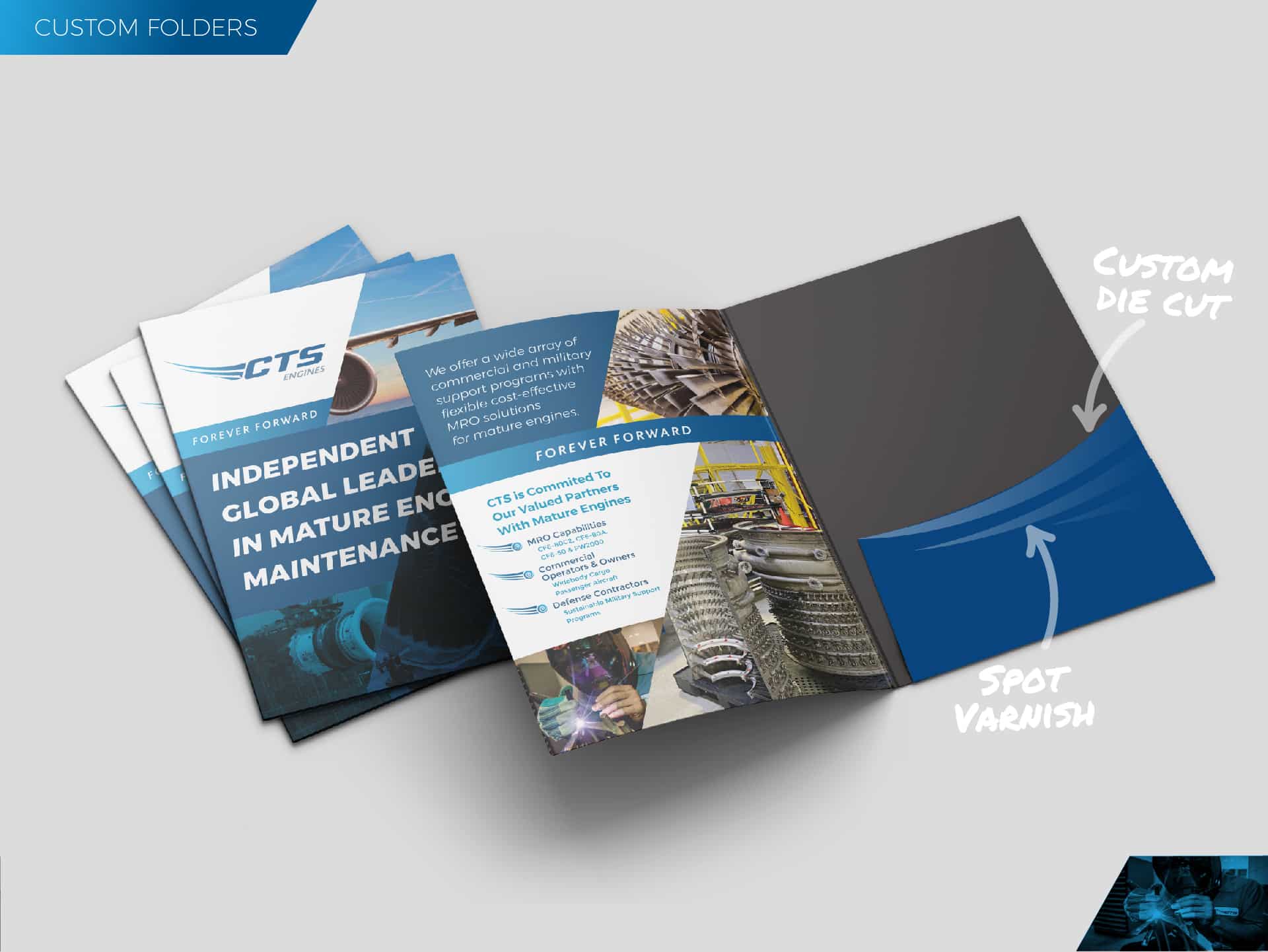
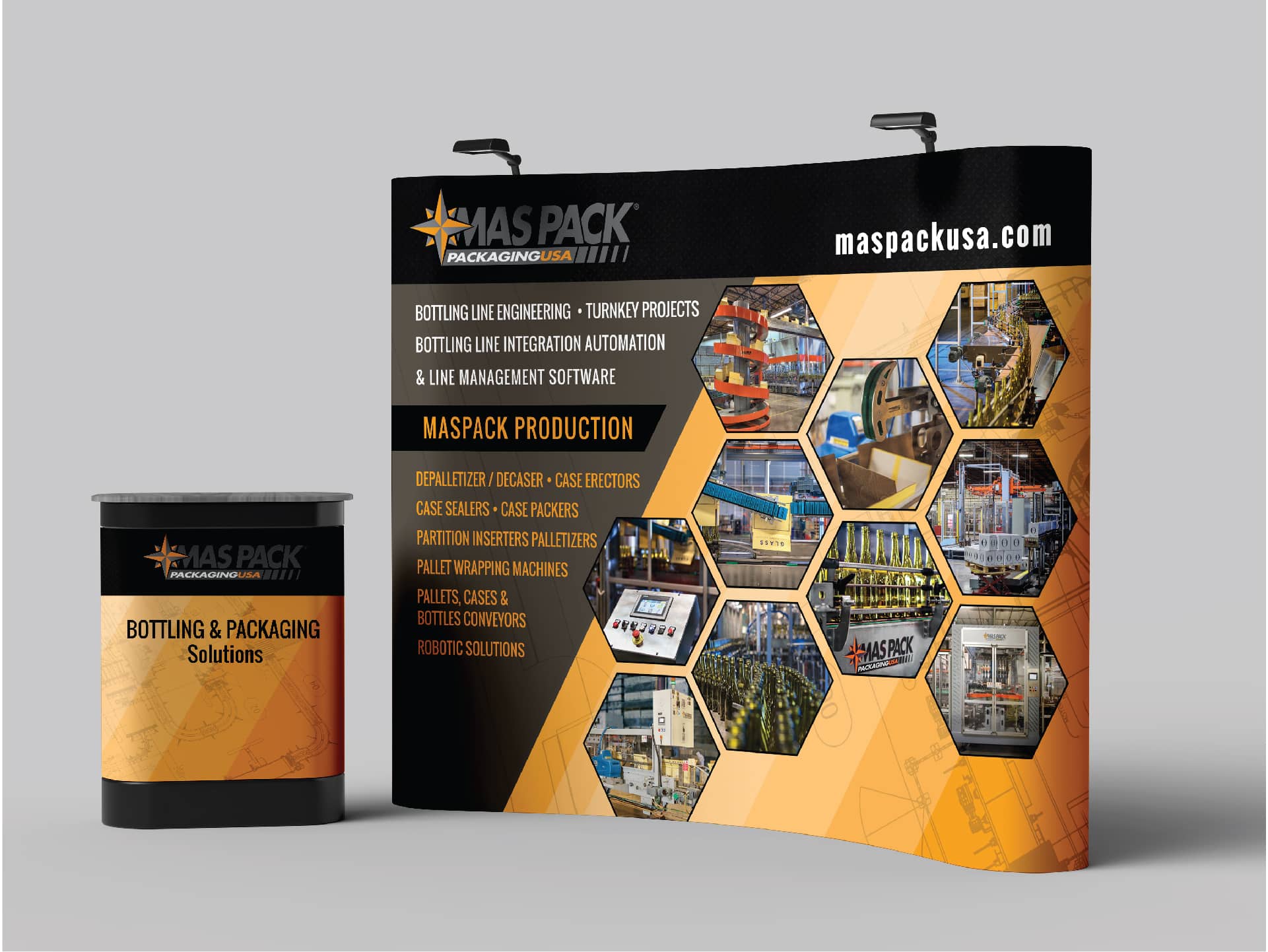
Every project tells a story of transformation. From crafting cohesive brand identities to executing polished marketing campaigns, my work reflects a commitment to excellence and measurable results. Explore a selection of projects where strategy and creativity came together to elevate brands and drive success.


