Logo usability
Support a mark and identity system that can hold up across product and digital contexts. This is the part a buyer usually judges before they can explain why. If it feels weak, the company starts the conversation from a disadvantage.
A brand and graphic design case study for a promotional-products company where the identity has to work on products, sales materials, web assets, and everyday marketing.
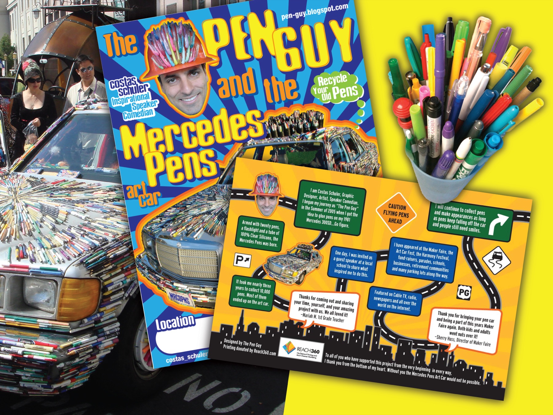
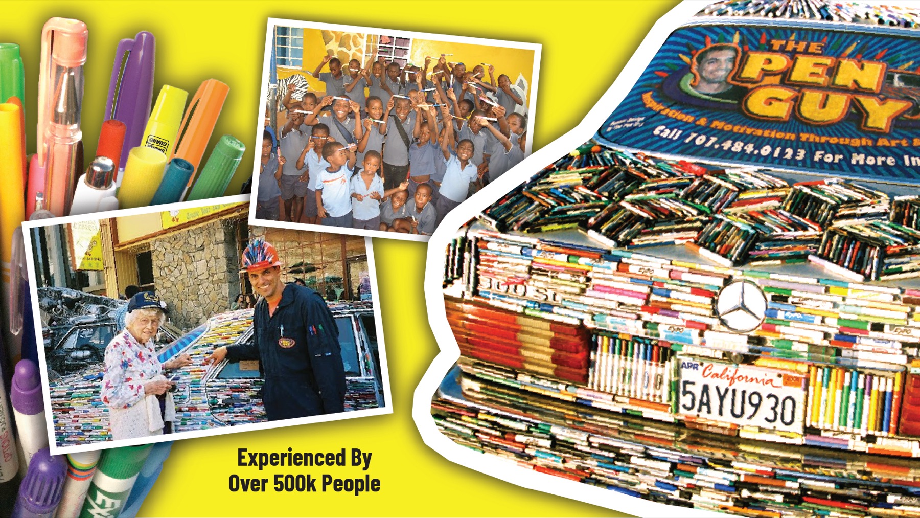
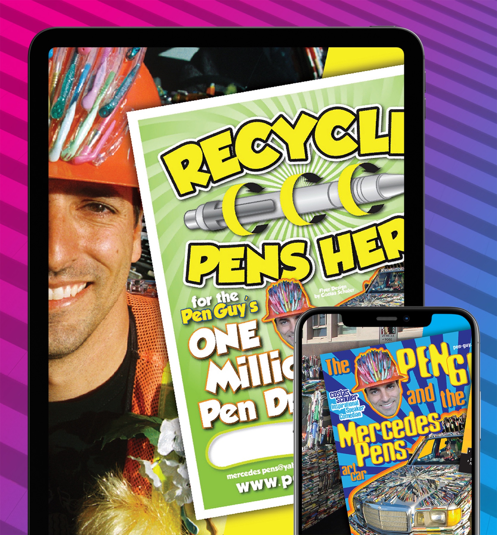
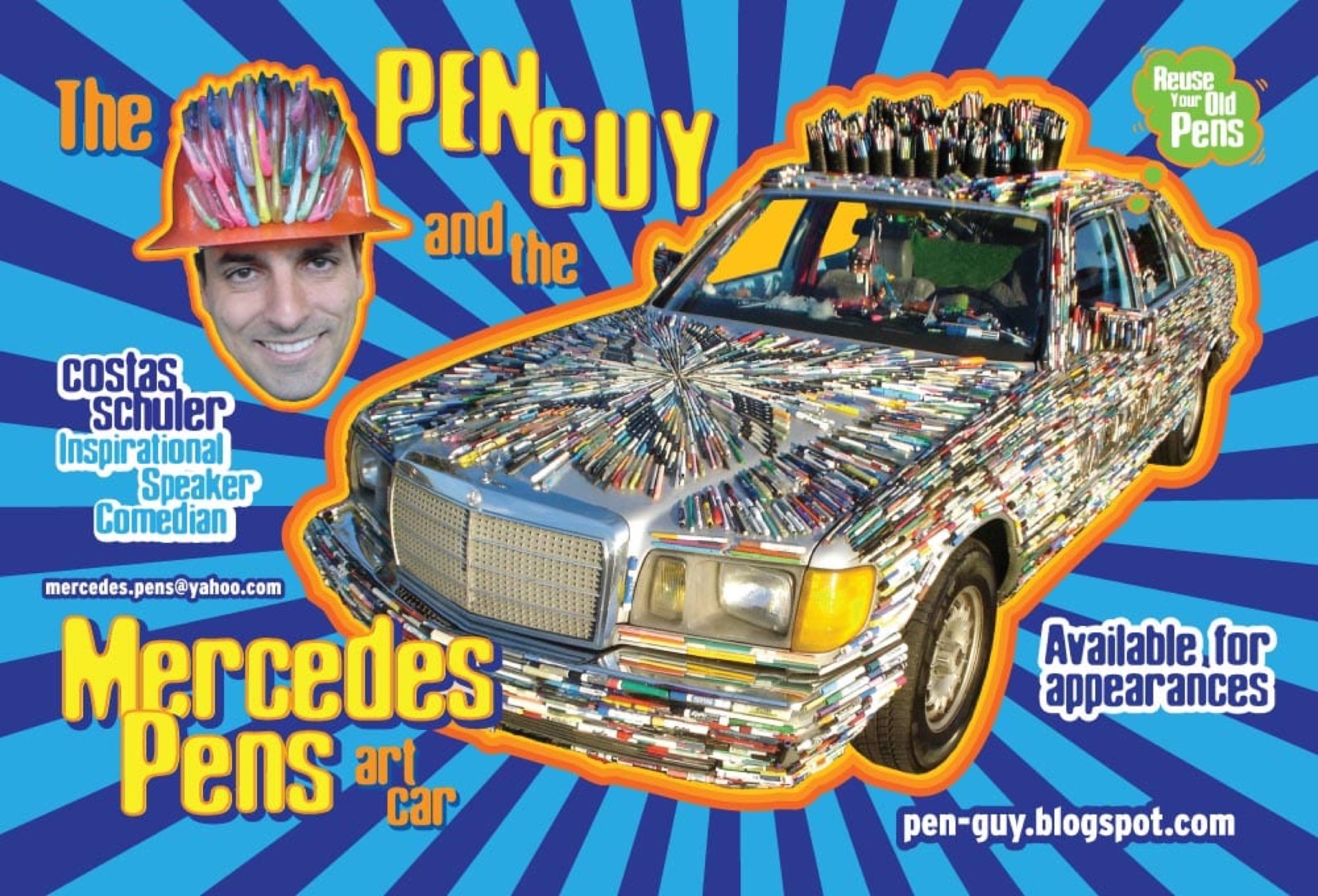
The Pen Guy supports Envisionary's logo redesign, graphic design, and branding proof. A promotional-products brand has to work in the real world, across small surfaces, sales conversations, digital assets, and product-driven marketing.
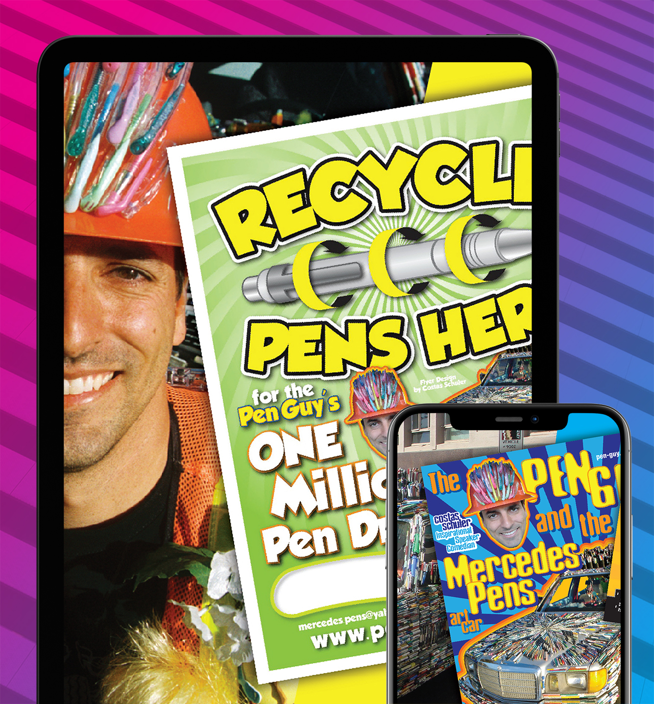
Promotional-products companies live across many surfaces. The brand has to survive small sizes, product mockups, sales sheets, web pages, catalogs, and quick-turn marketing. A weak identity system makes every new asset harder.
The Pen Guy fits the kind of practical brand problem where logo design and graphic design need to work together. The identity cannot just look good on a presentation slide. It has to be usable.
The work supports a more consistent product-facing brand presence. That means visual choices that can carry into product mockups, web assets, collateral, and recurring marketing needs without falling apart.
For Envisionary, The Pen Guy is useful proof for the logo redesign and graphic design pages because it shows how identity decisions affect everyday business materials.
| Layer | Role In The Work |
|---|---|
| Logo usability | Support a mark and identity system that can hold up across product and digital contexts. |
| Product presentation | Make promotional items and sales materials feel more organized and recognizable. |
| Graphic consistency | Create a stronger connection between brand, marketing, and sales assets. |
| Service proof | Support logo redesign, graphic design, and branding pages with a tangible product example. |
| Signal | Why It Matters |
|---|---|
| More practical identity | The brand can work across small surfaces and recurring marketing assets. |
| Cleaner sales support | Product-facing materials can feel more consistent and easier to trust. |
| Stronger logo proof | The case study gives the logo redesign page a relevant real-world example. |
This case study is not here as a decoration sample. It is here because The Pen Guy shows how branding / promotional products has to support a real business situation: a specific buyer, a specific level of trust, and a specific reason to believe the company is worth contacting.
When a prospective client reviews this kind of work, the useful question is not whether the page has a nice visual moment. The useful question is whether the brand, website, and supporting materials reduce doubt, clarify the offer, and make the company feel easier to choose.
Support a mark and identity system that can hold up across product and digital contexts. This is the part a buyer usually judges before they can explain why. If it feels weak, the company starts the conversation from a disadvantage.
Make promotional items and sales materials feel more organized and recognizable. This is where design becomes business infrastructure. The asset has to carry trust, not just fill space on a page.
Create a stronger connection between brand, marketing, and sales assets. This is what makes the work useful after launch. The visual system needs to keep helping sales, marketing, and communication.
The brand appears across many small and practical surfaces, so consistency and usability matter more than decorative design.
Yes. A logo that fails at small size or on product mockups creates friction across the business.
Yes. Better sales sheets, web graphics, product visuals, and campaign assets can make the company easier to buy from.
It shows how a logo system has to work beyond a single mark and across everyday marketing materials.
Review the logo files, product contexts, sales collateral, and the assets the team recreates most often.
Bring your idea, current project, or agency brief. We’ll talk through what you need, what’s holding it up, your timing, and where I can help. If we’re a fit, we’ll agree on the next step.