
Mind the Gap: Into The Kerning Zone…
In a world where every gap can lead to the abyss…
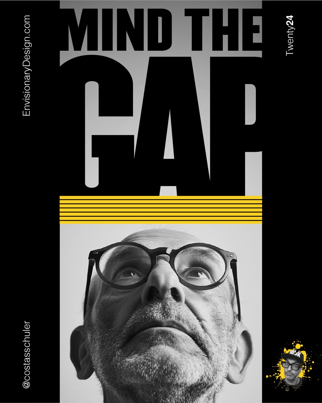
Picture, if you will, one man on a mission to mind the gap…
In the shadowy realm of typography, lurks an often-overlooked menace: bad kerning. Most don’t see it, many don’t care, but its consequences are dire. Poorly spaced letters can disrupt harmony, fracture brands, and lead unsuspecting audiences into realms of confusion and chaos.
A race against space to avert disaster…
This is a race against space that leads to a fractured universe, altering time, and confusing audiences, throwing them into unknown realms. One wrong move, one poorly spaced letter, and the brand plunges into the void of disjointed, unreadable text.
One man’s obsession…
One man’s obsession with “kernophobia” have kept the universe from fracturing. His only job: to MIND THE GAP. Unknown and toiling deep inside his mind, he ensures that every letter, every space, is perfect. He guards the integrity of every logo, every word.
And so, he minds the gap, so you don’t have to.
Have your people call my people before its too late!
Latest Creations From The Lab